An experimental diagnostic tool that plots the fitted values versus the
actual average values. If distribution is "Bernoulli" or "Poisson",
then the predictions are converted to the response scale (probability or
rate). For all other distributions, the calibration plot uses least squares
and predicts an expected value.
Arguments
- y
the outcome 0-1 variable
- p
the predictions estimating E(y|x)
- distribution
the loss function used in creating
p.BernoulliandPoissonare currently the only special options. All others default to squared error assumingGaussian- replace
determines whether this plot will replace or overlay the current plot.
replace=FALSEis useful for comparing the calibration of several methods- line.par
graphics parameters for the line
- shade_col
color for shading the 2 SE region.
shade_col=NAimplies no 2 SE region- shade_density
the
densityparameter forpolygon- rug.par
graphics parameters passed to
rug- xlab
x-axis label corresponding to the predicted values
- ylab
y-axis label corresponding to the observed average
- xlim, ylim
x and y-axis limits. If not specified the function will select limits
- knots, df
these parameters are passed directly to
nsfor constructing a natural spline smoother for the calibration curve- ...
other graphics parameters passed on to the plot function
Details
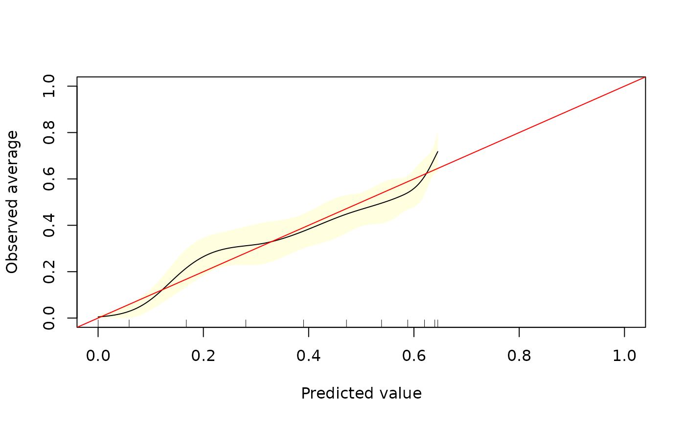
Uses natural splines to estimate E(y|p). Well-calibrated predictions imply that E(y|p) = p. The plot also includes a pointwise 95
References
J.F. Yates (1982). "External correspondence: decomposition of the mean probability score," Organisational Behaviour and Human Performance 30:132-156.
D.J. Spiegelhalter (1986). "Probabilistic Prediction in Patient Management and Clinical Trials," Statistics in Medicine 5:421-433.
Author
James Hickey, Greg Ridgeway gregridgeway@gmail.com
Examples
dataSim <- data.frame(x=rnorm(1000))
dataSim$y <- with(dataSim, rbinom(1000, 1, 1/(1+exp(-(x-0.5*x^2)))))
# showing poor calibration of a linear model
glm1 <- glm(y~x, data=dataSim, family=binomial)
p <- predict(glm1, type="response")
calibrate_plot(dataSim$y, p, xlim=c(0,1), ylim=c(0,1))
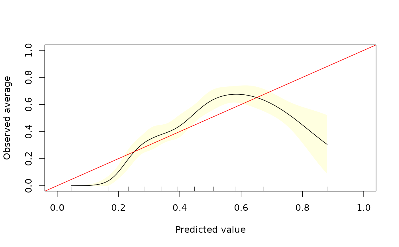 # showing better calibration with quadratic
glm1 <- glm(y~poly(x,2), data=dataSim, family=binomial)
p <- predict(glm1,type="response")
calibrate_plot(dataSim$y, p, xlim=c(0,1), ylim=c(0,1))
# showing better calibration with quadratic
glm1 <- glm(y~poly(x,2), data=dataSim, family=binomial)
p <- predict(glm1,type="response")
calibrate_plot(dataSim$y, p, xlim=c(0,1), ylim=c(0,1))